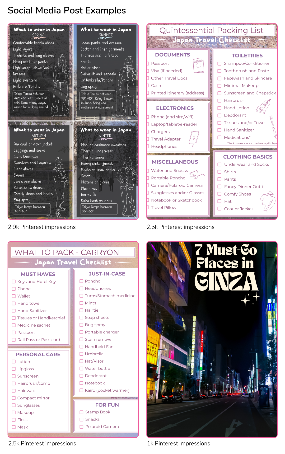
I used pleasing colors and Japanese-inspired imagery to create this blog and its graphic design. I use unique colors that add a personal touch to stand out from similar Japan travel blogs.
From a visual standpoint, my photography does most of the talking, so I opted to keep the palette minimal. The design choices I make for the blog are based on legibility and accessibility as well as aesthetics. These high-contrast colors are influenced by beautiful, ephemeral sakura and Mt. Fuji against the blue sky.
The deliberately hand-drawn assets allow me to express my love for doodling and create a journal-like feeling in the blogs. They also allow for more interesting posts, including social media content.